
Image
10 Essential E-Commerce and Shopping Icon Packs for Your Website
Read More
/18 May 2026
Building a personal finance app or a banking website requires clarity. If a user can't instantly tell which button opens their savings bucket and which one pulls up a tax document, they'll leave. Good iconography handles the heavy lifting, turning complex numbers into a clear interface.
Instead of hunting through generic asset packs, use these specific icon sets built for fintech and budgeting tools.
Nucleo doesn't just dump a giant batch of random graphics on you. Their system lets you toggle between outline, filled, and colored styles natively.
The set includes about 150 financial vectors. It covers standard requirements like wallets and charts, but adds hard-to-find options for compound interest, crypto tokens, and multi-currency ledgers. Every icon sits on a pixel-perfect 24px base grid, so your layout won't break when you swap a "send" arrow for a "receive" arrow.
Streamline is one of the largest icon libraries out there, and their fintech module runs deep. You can grab them in multiple weights, including a clean light line and a heavy bold option.
The pack goes beyond basic metaphors. Instead of ten minor variations of a dollar bill, you get specific symbols for tax brackets, invoice processing states, and portfolio risk management.
If you need something built directly inside Figma without dealing with an external marketplace subscription, start here.
This is a free, open-source set focused on mobile-first banking. The stroke weights are optimized for small mobile screens. If you're building a budgeting app where elements get crammed into a bottom navigation bar or tight transaction rows, these stay clear even down at 16px.
Flat line art is the default, but consumer budgeting apps sometimes need more texture to keep people engaged.
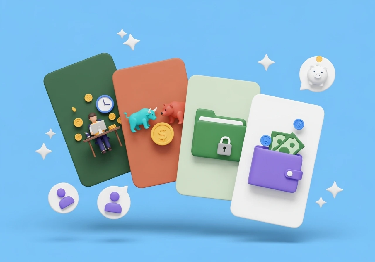
Icons8 offers high-resolution 3D renders available in PNG and OBJ formats. Gamified budgeting tools thrive on micro-interactions. A 3D piggy bank that wobbles when a user saves money or a metallic vault icon for premium tiers makes an interface feel responsive.
First, don't reinvent the wheel. A pig with a slot in its back means savings. A leather wallet means your current balance. A piece of paper with a folded corner means a bill. Don't try to make an abstract geometric shape represent a tax return because you think it looks sleek. Users will just find it confusing.
Second, check your visual weights. If you mix a thin outline icon from one pack with a solid, heavy icon from another, the app looks messy. Pick a single style and use it across the entire user flow.