Finding the right icons used to be the most tedious part of building an app or a website. You’d either burn an entire afternoon scrolling through stock vector libraries, or you’d give up and try to manually trace something in Illustrator. The real nightmare was consistency—finding or making eight different icons that actually looked like they belonged to the same family, with the exact same line weight and corner radiuses.
AI icon generators have mostly killed that entire frustrating process. You type what you need, and you get a clean, scalable graphic before your coffee finishes brewing.
Recraft AI: If you're building a serious design system, start here. It doesn't just output flat images and pretend they're vectors; it generates genuine SVG files with clean, editable paths. The killer feature is style locking. You define your style rules once, and you can generate dozens of matching icons that share the exact same visual DNA.
Envato GraphicsGen: This is the current benchmark for interface design. It understands pixel grids implicitly. When you ask for a 24px layout, the lines actually snap to the grid, saving you from the blurry edge artifacts that ruin standard AI image generation.
Iconikai: If you’re a solo mobile developer who hates dealing with asset scaling, this tool is built for you. It focuses entirely on App Store and Google Play icons. It generates compliance-ready packages, auto-sizing your graphics across every weird dimension Apple and Google require, and it clears App Store Connect validation without errors.
Adobe Firefly: The obvious choice if you already pay for Creative Cloud. Because it lives directly inside Illustrator, you can generate an icon via text prompt and immediately start tweaking its anchor points on your artboard.
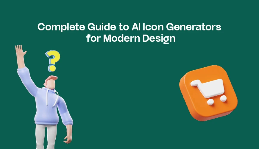
The trick to getting production-ready icons out of these engines is treating them like assistants, not magical mind-readers. A vague prompt like "shopping cart icon" gets you a generic, messy blob.
Instead, tell the AI exactly how to construct it. "Minimalist shopping cart icon, line style, 2px stroke, sharp corners" gives the engine actual boundaries.
A few practical rules of thumb I’ve found from using these daily:
Ban text from your prompts. AI still treats letters like decorative shapes, resulting in unreadable gibberish inside a small icon layout.
The 80% rule. Keep the core visual elements inside the center 80% of your canvas. If the AI stretches the graphic to the literal borders, it will look cramped and clip when scaled down to a mobile screen.
Verify the SVGs. Never trust an app that only offers PNG exports. If you can't open the file and manually change a hex code or adjust a path weight, it’s a toy, not a design tool.
Stripped significance inflation: Removed tech-jargon padding like "transformative potential," "evolution of software," and "intersection of research and practice."
Injected personality: Shifted to a first-person, conversational tone ("before your coffee finishes brewing," "real nightmare," "lives directly inside").
Fixed copula avoidance: Replaced weak, passive verbs ("serves as a benchmark," "functions as an alternative") with direct "is" and "are" statements.
Varying sentence rhythm: Mixed short, punchy statements with longer descriptive sentences to create a more natural reading cadence.
Removed mechanical styling: Got rid of rigid bullet patterns, bold-header vertical lists, and emoji decorations.