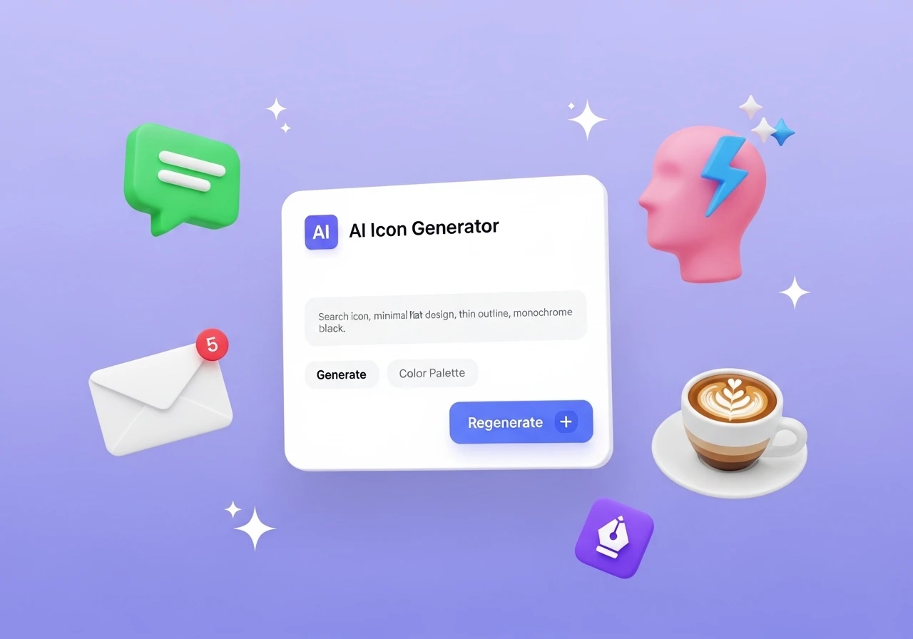
Illustration
Best React Icon Libraries Developers Should Use in 2025
Read More
/18 May 2026
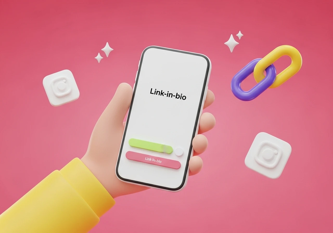
If you want visitors to actually click through to your shop, your podcast, or your newsletter, you need to make the page visual. Customizing your icons is the easiest way to break up the text and point people exactly where you want them to go.
Here are a few practical ways to use icons to upgrade your page layout.
Instead of the standard YouTube play button or Spotify wave icon, use a graphic of the actual thing the user gets when they click. It breaks up the monotony and gives a clearer visual cue.
For a podcast: Use a vintage microphone or headphones.
For an online shop: Use a shopping tote or a price tag.
For a newsletter: Use a stamped envelope or a newspaper icon.
For a booking link: Use a desk calendar.
Don't settle for the default, sterile line icons built into your bio tool. Find a style that matches your actual content.
If your vibe is retro, use 8-bit pixel art or old-school desktop folder shapes. If you run a creative or casual brand, use hand-drawn doodles or thick-lined cartoon icons. You can grab cheap icon sets on Flaticon or Creative Market, or just customize a set inside Canva using your specific brand colors.
If you have five links on your page, they shouldn't all look identical. You want people to notice your top priority—like a new product launch or a flash sale.
Try using a subtle GIF or a gently pulsing icon for that single, high-priority button. A slight tilt or a shifting color gradient naturally draws the eye down the page. Just keep it limited to one animated element so your page doesn't look like a chaotic 90s website.
People connect with faces, not corporate symbols. If you are a creator or a solo business owner, use cutouts of yourself instead of graphic icons.
Take a few photos, pop the backgrounds out, and crop them into small circles with a clean border. You can match your expression to the link destination: use a shot of you holding a coffee mug for a "Buy Me a Coffee" link, or wear headphones for your audio channels.
If you have more than five or six links, visitors get decision paralysis. Use small icon headers to categorize your page so it's easier to navigate.
Instead of a plain text header for "My Gear," use a small camera icon next to the text. Put a heart icon next to "Support My Work," or a book icon next to "Current Reads." This helps users skim the page and find what they want in a couple of seconds.
If you don't want to deal with uploading custom images, you can use emojis as icons—just be disciplined about it. Instead of picking random emojis for every button, stick to a tight, 3-to-4 emoji theme that fits your industry.
A tech reviewer might exclusively use the laptop, lightning bolt, and brain emojis (💻, ⚡, 🧠). A plant or gardening creator might stick entirely to greens and earth tones (🌿, 🪵, 🌻). Putting the same targeted emojis at the start of your links creates a cohesive look without any extra design work.
Note: When uploading custom icons to platforms like Linktree or Beacons, save them as transparent PNGs or SVGs so they look clean against your background color.