Illustration
Creative Icon Ideas to Make Your Link-in-Bio Stand Out
Read More
/18 May 2026
Do you want to make your web and mobile designs look clean and modern? Choosing the right icon pack is a simple way to improve your user interface. Icons help users understand your app or website without reading a lot of text.
In this post, you will find the most popular icon sets this year. These options are easy to use and look great on any screen size.
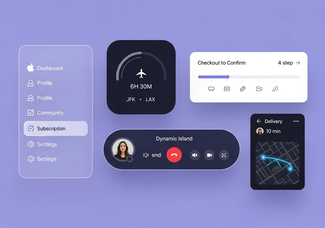
A UI icon pack is a collection of small, simple pictures.
Using a pre-made pack saves you time. You do not have to draw every single symbol from scratch. High-quality packs keep your designs consistent because all the symbols share the same visual style, line thickness, and corner shapes.
Using the right icon set helps your project in many ways. Here are three main reasons why they matter:
Better Usability: Clear symbols help users navigate your website faster. People recognize common symbols instantly.
Visual Balance: Good packs use consistent line weights.
Faster Development: Most top sets come with code packages for developers. This makes it easy to turn your design into a real website.
Here is a list of the top icon sets that professional designers use this year. These sets are reliable, accurate, and highly rated in the design community.
Phosphor Icons is a massive open-source library that is highly flexible.
Total Icons: Over 9,000 icons.
Styles: Outline, solid, and duotone.
Why to use it: It features six different weight variants. You can choose from thin, light, regular, bold, fill, and duotone styles to match your exact brand look.
This library was made directly inside Figma for digital product designers. It features a clean, neutral style that works for almost any project.
Total Icons: More than 1,100 essential icons.
Styles: Line and duotone.
Why to use it: The lines use smooth, natural curves on the corners. They are set to a standard 2px stroke weight by default, which looks perfectly balanced on mobile screens.
If you hate running out of options, Hugeicons is a great choice.
Total Icons: Over 46,000 icons in their full system.
Styles: Stroke, solid, two-tone, duotone, bulk, rounded, and sharp.
Why to use it: It has a dedicated Figma plugin and a web app.
Tabler Icons is a highly detailed set made by web developers. It is perfect for complex digital products like dashboards, charts, and admin panels.
Total Icons: Nearly 5,000 icons.
Styles: Outline and solid.
Why to use it: It offers deep coverage for data-heavy layouts.
Lucide is a community-run project.
Total Icons: More than 1,600 icons.
Styles: Outline only.
Why to use it: It is the default choice for popular modern coding frameworks. The symbols are lightweight, simple, and look very crisp on high-resolution screens.
Remix Icon provides a neutral, open-source library.
Total Icons: Over 3,200 icons.
Styles: Outline and solid.
Why to use it: Every outline symbol has a matching solid version. This makes it easy to change the look of a button when a user hovers over it or clicks it.
Created by the team behind Tailwind CSS, Heroicons are built specifically for web user interfaces rather than complex illustrations.
Total Icons: Over 300 targeted icons.
Styles: Outline, solid, and mini.
Why to use it: They come in three specific sizes optimized for different contexts.
With so many choices, picking the right set can feel difficult. Follow these quick steps to find the best match for your project:
Check the Formats: Ensure the library offers SVG or Figma formats. Do not use PNG files because they become blurry when you change their size.
Look for Consistency: Pick a pack where every symbol uses the same corner roundness and line thickness.
Test the Meaning: Make sure the symbols are easy to understand. If a user cannot guess what an icon means instantly, add a text label next to it.
Keep Touch Targets Large: If your icons are buttons, make sure the clickable area is at least 48px by 48px so people can tap them easily on mobile phones.
Using a great icon set makes your website look professional and helps your users navigate easily. Stick to popular libraries like Phosphor, Untitled UI, or Lucide to keep your layout clean. Try these top trending UI icon packs every designer needs in 2026 to improve your next design project today.